What Color Should Your Logo Be?

what color should your logo be

How to Pick the Perfect Color

What Color Should Your Logo Be?

Color has a major impact on how we perceive the world around us.

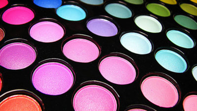
Research has shown that the psychology of color can not only influence the way food tastes, the way some medicines perform, and the way we feel — it can also play a massive role in our brand preferences and buying habits.

But selecting the right colors for your company logo (or a client’s logo) can be tricky. You want the color scheme to attract your company’s target consumers and elicit positive emotions, but your own personal color preferences can easily get in the way.

Just because blue is your absolute favorite color, it doesn’t mean your target persona feels the same way. You need to put yourself firmly in their shoes to find a color scheme that reflects their preferences, habits, and interests.

How to Pick the Perfect Color for Your Logo

The universal sign of excitement, passion, and anger. Is your brand loud, playful, youthful or modern? Think red. More mature, classic or serious? Red may not be for you.

An invigorating, playful color. Go orange to stand out from the crowd. It’s used less often than red but still packs an energetic punch.

Accessible, sunshiney friendliness. Yellow exudes cheer, and your brand will radiate an affordable, youthful energy. Nobody puts yellow in a corner!

The ultimate in versatility, green isn’t linked with many brand personality traits, but it has strong cultural associations. Are you in finance? Gardening? Consider going green.

The classic king of colors, blue appears in over half of all logos. As it symbolizes trustworthiness and maturity, true blue will make sure you’re taken seriously.

Where the rainbow gets luxurious. Paint with purple to appear simultaneously cutting-edge and wise. There’s just a hint of femininity in there too.

Nothing says “girly” quite like pink. But it’s more versatile than that. From pastel rose to neon magenta, pick pink for a modern, youthful, luxurious look.

What can brown do for you? Make your brand appear rugged, masculine and serious. Brown is very underutilized, so you’ll stand out from the competition.

Black is the new black. Want to look slick, modern and luxurious? Time to go black. Rather be economical and affordable? Stay away from the dark side.

The absence of color. White is youthful and economical, but can work for almost any brand. As a neutral color, consider white as a secondary accent.

Not quite dark, not quite light. Gray is the middle ground of mature, classic and serious. Go darker to add mystery. Go lighter to be more accessible.


CREDITS: Karla Cook @